Kelly Phillips


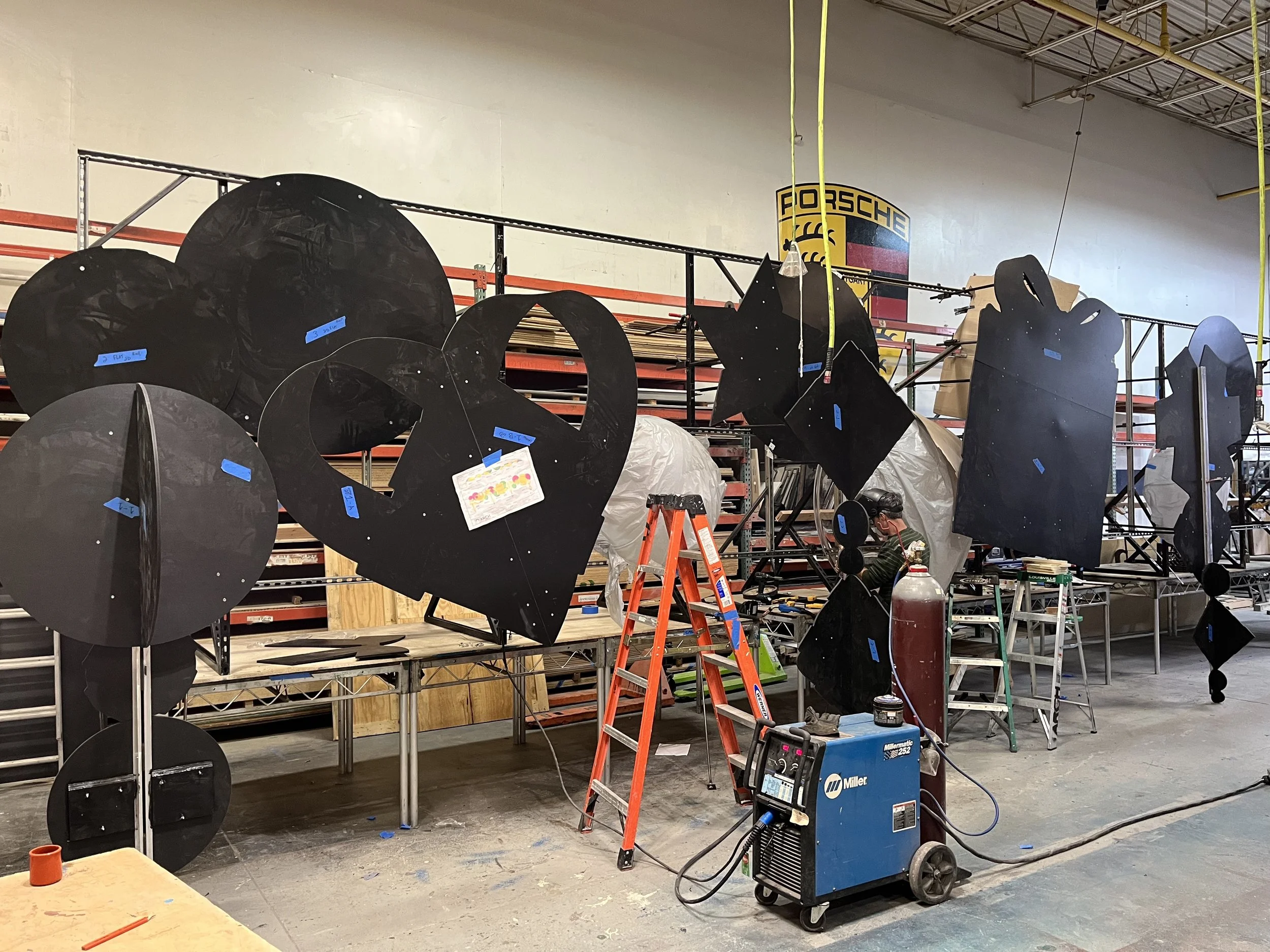
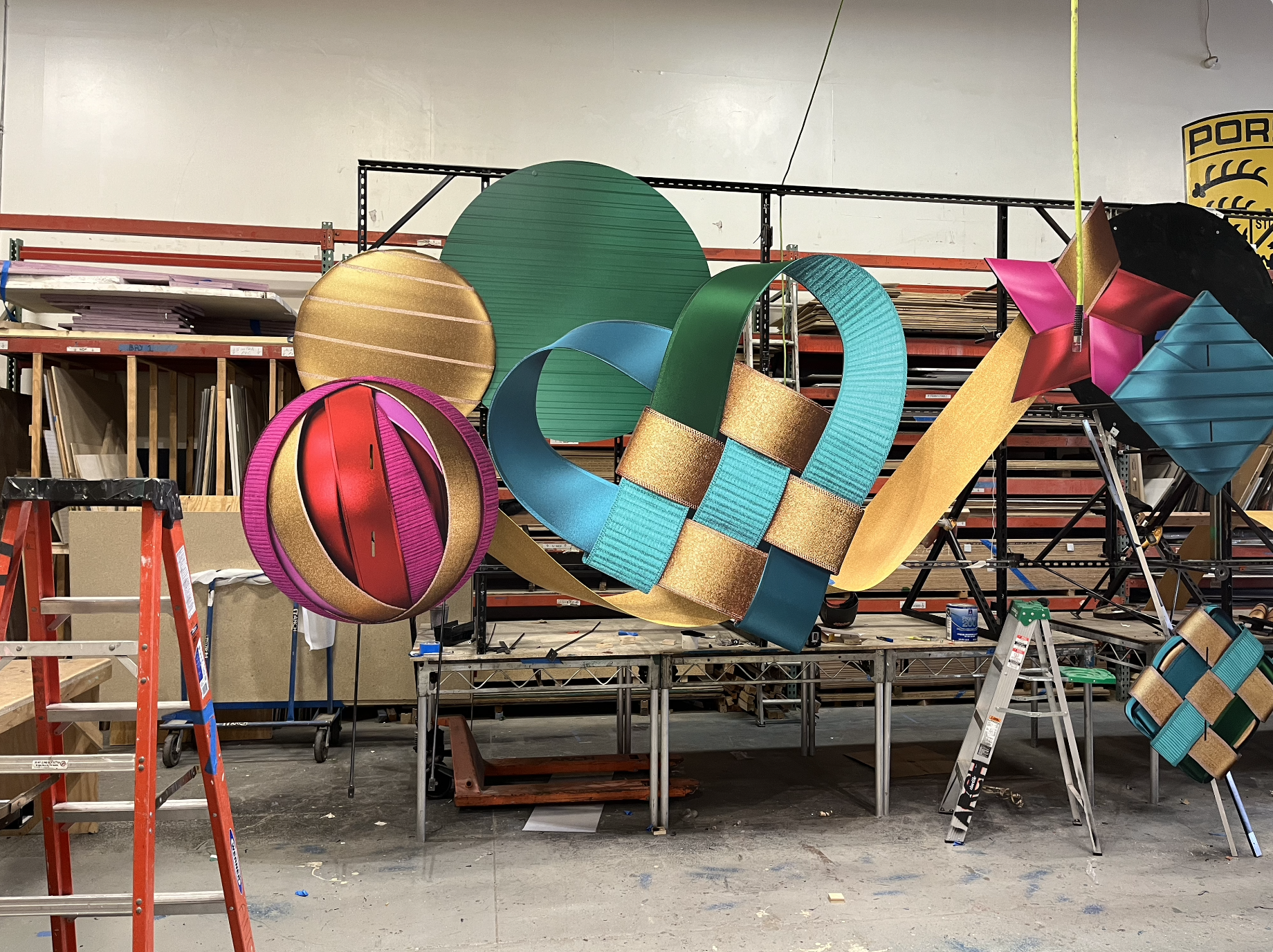
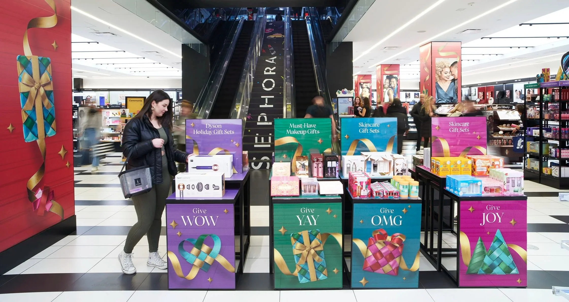
For Sephora’s 2022 holiday campaign, I designed 3D retail installations for the brand’s New York City flagships in Times Square and SoHo. The concept brought the Give Something Beautiful campaign to life, translating CGI–created woven holiday cues into immersive, gift-inspired environments.

I collaborated closely with external visual merch & production teams to evolve the 2D campaign into large-scale, dimensional displays. My work included developing spatial layouts, color direction, and structure mockups for custom installations and product displays, all executed within budget while maintaining a cohesive and festive brand experience across every touchpoint. A project and achievement I will never forget.

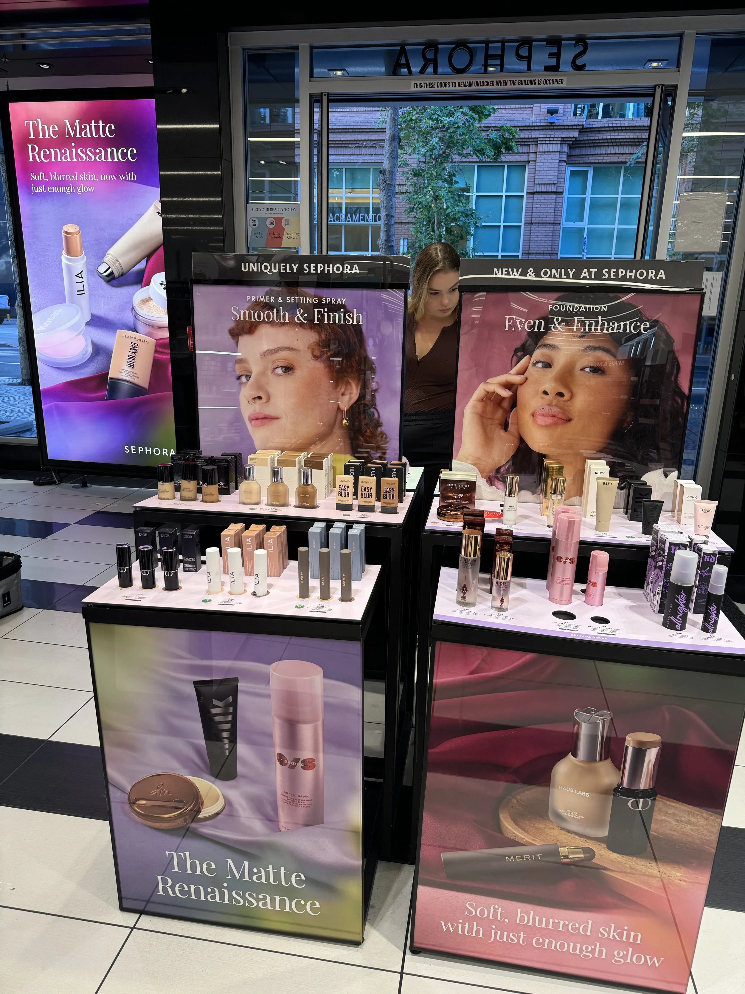
Oh look its the designer herself

As part of the creative response to the comeback of matte makeup, this campaign reimagined the trend as a dramatic "Matte Renaissance." We leaned into the theatricality of editorial storytelling, drawing direct inspiration from Renaissance art and culture, modernized for the bold, trend-driven aesthetic of Sephora.

We incorporated rich, textured fabrics and classical poses, referencing iconic Renaissance paintings while maintaining a contemporary edge. The product photography took cues from traditional still life and fruit portraiture, treating each item like a work of art, carefully lit, composed, and styled to evoke a sense of timeless luxury.

Fragrance has always been one of my favorite and most rewarding categories to work on at Sephora. Over the years, I’ve contributed to a wide range of fragrance projects spanning print, digital, and social, each one an opportunity to evolve the storytelling and visual approach.

My work includes designing in-store print pieces and direct mailers that connect clients to new launches and exclusive scents. Each campaign brought new creative challenges, from refreshing layouts and navigation to reimagining templates for stronger engagement.

As paid and organic media continue to evolve, I’ve also focused on strengthening the performance of fragrance assets across social platforms, refining motion, messaging, sound and visual structure to make every placement feel elevated and on brand.

To announce Sephora’s full entry into the hair care space, a category not traditionally associated with the brand, we created a bold, high-impact campaign designed to make a splash.

The concept centered on excess: lots of hair, lots of lather, and an unapologetically modern showcase of products. Visuals leaned into rich, glossy textures and close-up details, bubbles, strands & drips to evoke freshness and indulgence.

The product lineup was heroed through clean, sculptural styling that felt elevated but accessible, positioning Sephora as a serious destination for all things hair. This was a debut that didn’t whisper it shouted.


This campaign aimed to evolve the visual language of Sephora’s Clean Beauty category, modernizing the aesthetic to better resonate with a younger, ingredient-aware audience, while also making the assets more versatile for year-round use.

We reimagined Clean not as minimal or sterile, but as fresh, vibrant, and editorially elevated. The creative direction focused on clean textures, contemporary set design, and a warm, approachable palette that felt both aspirational and accessible.

In addition to driving brand perception, the campaign was designed with longevity and usability in mind. We produced a robust library of imagery that could be used modularly by internal teams and external agencies streamlining content creation and reducing lift for future launches.

For the holiday season, we partnered with ‘Man Vs Machine’ to craft a series of luxurious, dreamlike compositions for Sephora’s holiday fragrance mailer, a coveted piece that both consumers and brands look forward to each year.

This was a highly collaborative and nuanced project, given the sensitivity around brand representation. Each fragrance needed to be heroed equally, no product could outshine another. Our creative solution: a surreal yet harmonious holiday world where every fragrance sat in its own carefully art-directed moment, connected by a shared visual language of sparkle, sophistication, and seasonal warmth.

Using CGI allowed us to build an elevated, flexible environment that felt magical yet brand-right, with the added benefit of precise control over lighting, texture, and composition. These visuals were adapted seamlessly across print and digital, creating a unified, premium holiday story that celebrated the full fragrance lineup, without ever playing favorites.

Working on the launch of Fenty Beauty at Sephora was both an honor and a career highlight. This wasn’t just another brand drop, it was a cultural reset that broke records, redefined beauty standards, and set a new bar for inclusivity in the industry.

Our creative approach mirrored the brand’s bold, unapologetic energy. Every touchpoint from in-store visuals to digital rollout was designed to feel fresh, powerful, and universal. We helped bring Fenty’s wide shade range and boundary-pushing ethos to life in a way that resonated with both longtime Sephora shoppers and first-time customers who finally felt seen.

More than a launch, this was a moment and being part of that moment was unforgettable.

One of my earlier projects at Sephora, this digital-only launch for Tarte’s aquatic-inspired collection was a great opportunity to flex my design skills while supporting a full campaign rollout across Sephora’s digital platforms.

As part of the design team (prior to becoming a senior), I helped bring the collection’s underwater, iridescent vibe to life playing with fluid compositions, that echoed the look and feel of the product packaging. It was a small launch, but one that allowed us to get playful within Sephora’s digital ecosystem while aligning closely with Tarte’s vibrant brand identity.

These interactive gift guide-style quizzes were created to help Sephora customers navigate products based on their individual beauty needs. As part of a growing initiative to turn discovery into a more playful and personalized experience, I worked on two distinct visual approaches:

Hair Care Finder:
Inspired by the tactile world of paper craft, we brought hair concerns to life using cut-paper textures that visually echoed each issue; frizz, dryness, damage, etc. The result was a vibrant and sculptural digital experience that translated across platforms, turning a functional quiz into an eye-catching moment of brand storytelling.

Mascara Finder:
For this project, I leaned into my own illustrations to create a fun, approachable look and feel. The whimsical doodles and energetic typography helped break down mascara benefits like curling, lengthening, and volumizing in a way that felt friendly and easy to engage with, ideal for a younger or first-time Sephora shopper.

Together, these quizzes demonstrated how visual design and thoughtful UX could guide users seamlessly from concern to solution while also reflecting the unique tone and identity of each product category.

At PMI, I worked as both an illustrator and designer on a wide range of seasonal and trend-driven products for major retailers including Target, World Market, Francesca’s, Cracker Barrel, and more.

This role gave me hands-on experience designing everything from napkins and drinkware to packaging and partyware across both Halloween and Holiday collections. I created original illustrations, hand-lettering, and patterns that brought each product to life always balancing playful charm with mass retail appeal.

Whether it was a cheeky Halloween tumbler or a glitter-filled holiday cup, my designs were crafted to be eye-catching on shelf and production-ready, working closely with product developers to align with each retailer’s aesthetic and manufacturing needs.

This experience deepened my understanding of product lifecycle, licensing, and how to design with both creativity and commercial impact in mind. It was a short contract, covering for maternity leave, but I made sure to make the most of what felt like such a unique job.